I helped build Workit's rebrand of their visual identity and implemented it across their print, digital, app, and web assets + platforms.
Background
Workit Health is a company that works to increase access to substance use treatment and end stigma by bringing clinically-proven care to your phone. They work directly with consumers, enterprises, and healthcare networks to try to reach everyone in the loop. They are primarily design-led and focused, keeping their company user-centered and highly impactful.
Work
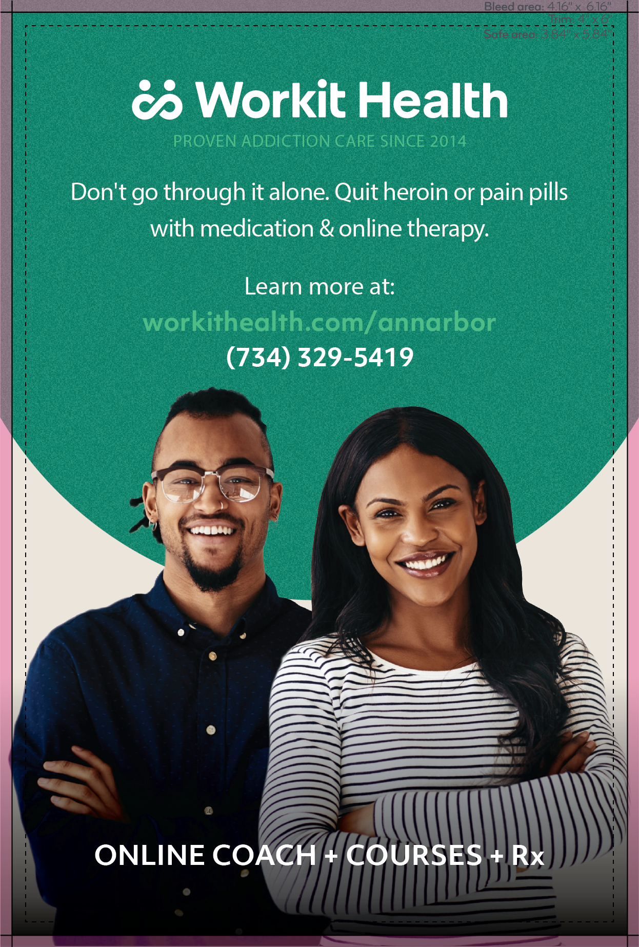
Throughout all of 2019 I was lucky enough to have worked with an amazing team at Workit Health. I was previously brought on as an intern and just loved the work and the mission so much that I kept going. During my time, I worked on drafting new UI for the mobile application, helping the company go through an entire rebrand, created print assets to go to members of Aetna, reworked slide decks, and helped create a better infrastructure for design jobs internally.
*Some of my work is protected by an NDA, but I've chosen a subset of my work below.
As we grew and learned more from our community, it was clear that they deserved more from us in depictions of representation, maturity, and trust.
Examining our previous identity
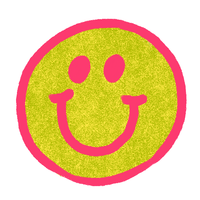
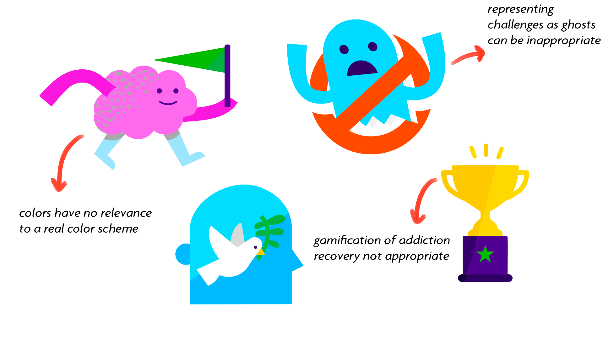
Workit's strength lies in its strong visual nature. Most healthcare companies use outdated visual assets and fail to keep in touch with their user base. I love that Workit is design-led (shout out to Robin, one of the badass cofounders!) and is not afraid to iterate. The right is an example of old Workit branding using characters and gamification.
While they are cute and quirky, in the context of the serious nature of addiction care they just are not appropriate. They also did not usually have any text accompanying them, almost leaving them floating.
Defining redesign opportunities
After extensive collaboration with the team, as well as some things I kept in mind on my own, these were the areas that I chose:
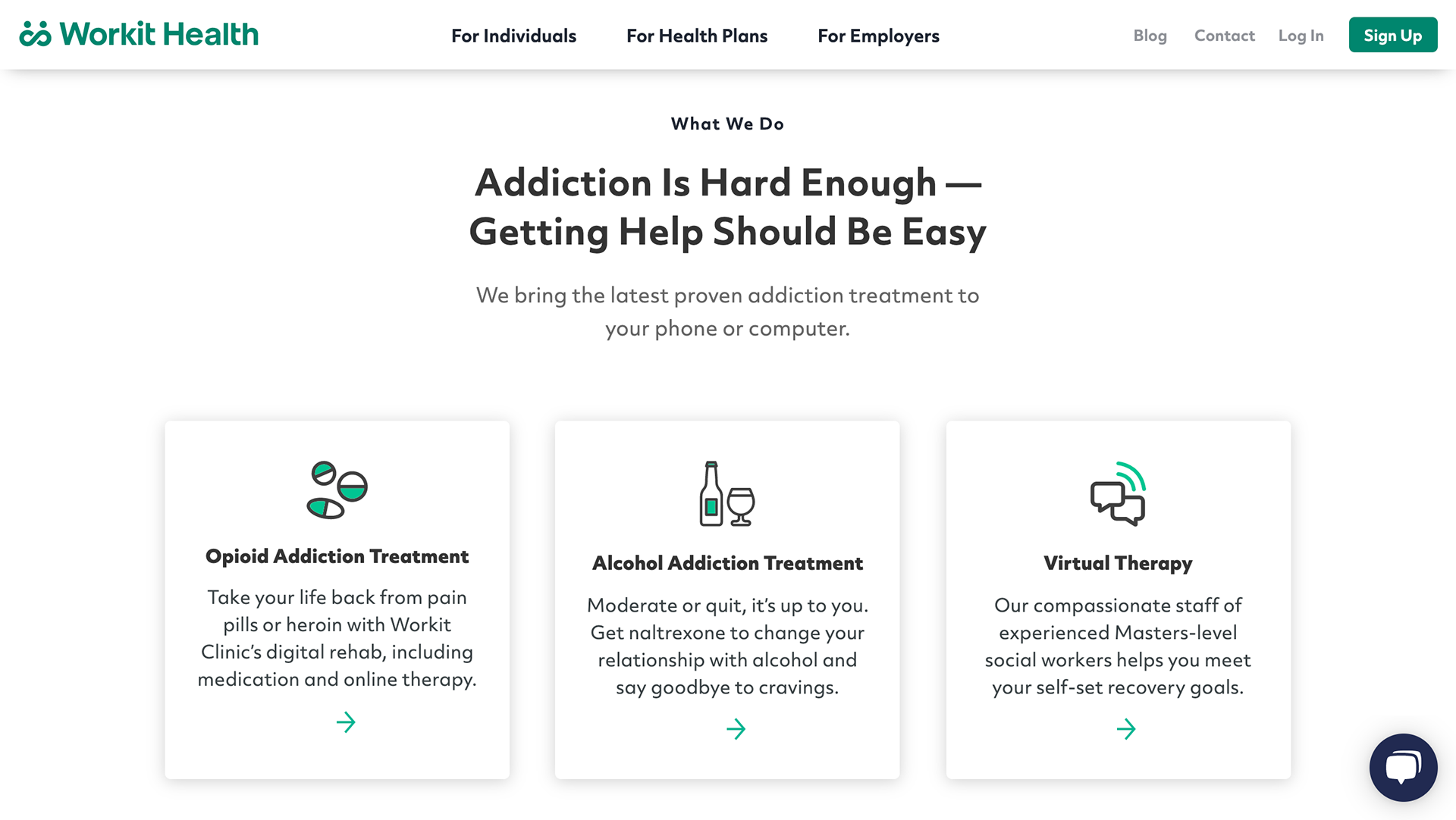
1.) Updating color, typography, and iconography to communicate maturity
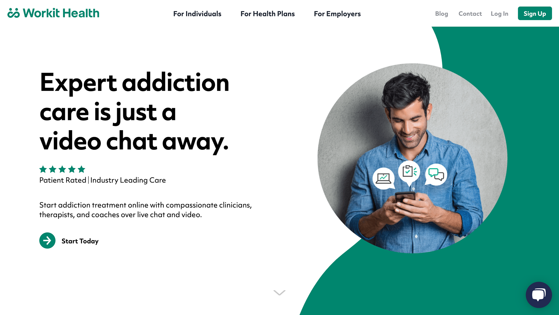
2.) Transitioning from cartoon graphics to strong, photographic messaging as a tool for meaningful, diverse representation in addiction as well as clearer communication
1. Color, typography, and iconography
Our previous green was one of a more neon-nature. This color was our signature, but also presented problems for accessibility, and so we switched to a darker green that would help signal the maturity of our identity.
We previously were using a mix of sans serif + serif fonts, but chose to use only sans serif for clarity and cleanness.
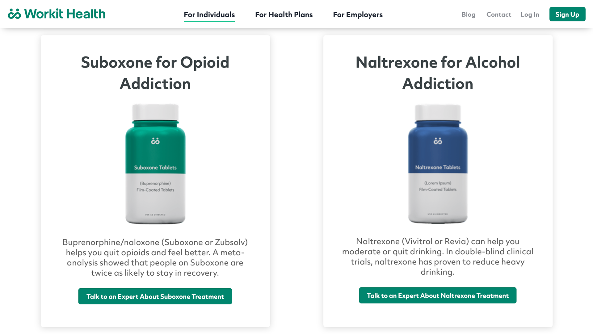
Instead of avatars, we chose to go with minimal, "clinical", and clean-looking icons that had accents of our old Workit green. We also decided that these icons would serve as accompaniments to help clarify text rather than standalone assets that could distract.
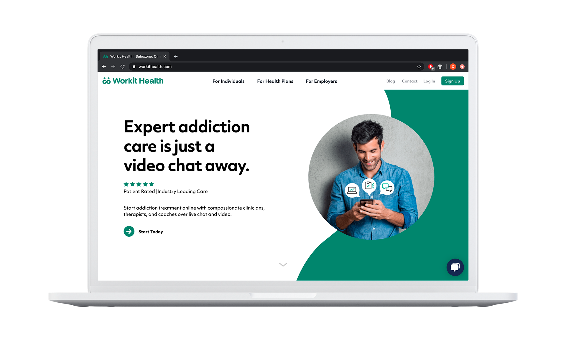
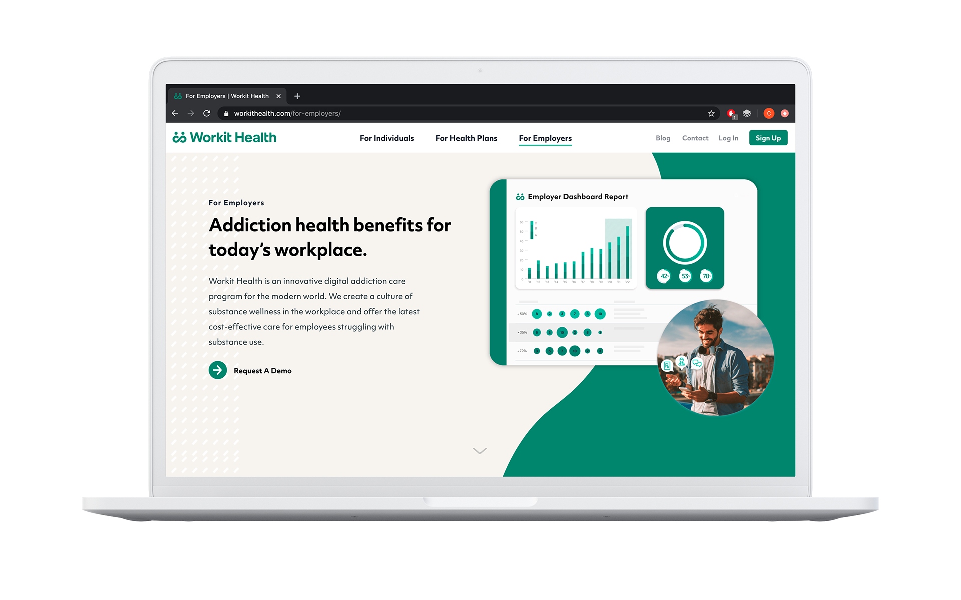
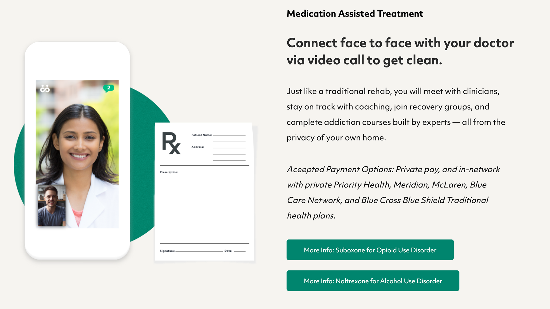
2. Strong photographic visual language
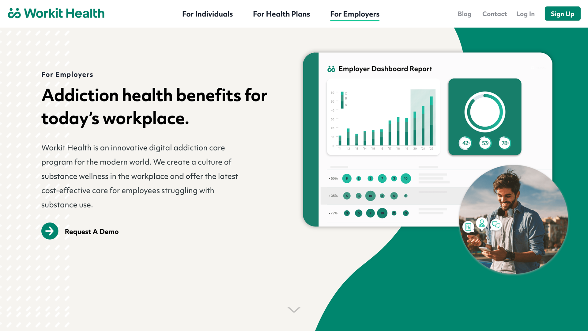
We chose to transition to photographs over graphics and illustration to further imply that we are a trust-worthy, people-powered and people-centered company rooted in everyone's wellbeing. When sourcing photographs for our various assets, I wanted to challenge stereotypes of what people with substance use are supposed to "look like", trying to get across that anyone can seek help for addiction. I also initiated a push for more diverse stock photography and videography specific to our ads, print, and digital assets.
With so many different stakeholders, we had to make sure that our assets were flexible to be used across different audiences. We made sure to err on the side of including product mockups often to reinforce legitimacy.
Final thoughts
Being a part of Workit Health's mission was one of my most fulfilling experiences of 2019. I'm proud to have been able to work with such an innovative, kind, and design-focused team. Their commitment to their community of users is one that I highly admire and want to pursue in all of my endeavors moving forward!